
The LEGO Group (TLG) are introducing two new colours for 2026. It's always exciting to see a new colour in the LEGO palette, although it does make us wonder if the 'one in and one out' rule introduced in the mid-2000s has been relaxed somehow in recent years?
.jpeg)
TLG are calling the two new colours 430 Warm Pink and 431 Blue Violet, so let's take a closer look at these new tones and see where to find them in the new January 2026 releases.
Products in this article were gifted by The LEGO Group; the author's opinions are their own.
This article contains affiliate links to LEGO.com; we may get a small commission if you purchase.
Set 42689 on LEGO.com Set 42691 on LEGO.com
 Set 42687 on LEGO.com
 Set 42696 on LEGO.com
 Set 31218 on LEGO.com
 Set 21365 on LEGO.com
 Set 11508 on LEGO.com
 Set 42679 on LEGO.com
 Set 42677 on LEGO.com
 Set 42699 on LEGO.com
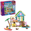
430 Warm Pink
.jpg)

.jpeg)
Which LEGO sets have 430 Warm Pink?
.jpeg)
- Brick 1 x 2 in Warm Pink (6583488 | 3004), found 9x in 42689 Heartlake City Friends Club House, and a whopping 49x in 42691 Garden Restaurant
- Brick Special 1 x 2 with Masonry Brick Profile in Warm Pink (6584805 | 98283), found 34x in 42687 Liann's Family House
- Brick 2 x 4 in Warm Pink (6583487 | 3001), found 8x in 42689 Heartlake City Friends Club House
.jpeg)
- Support Round 1 x 1 x 6 Solid Pillar in Warm Pink (6584818 | 43888), found 15x in 42691 Garden Restaurant
- Brick 1 x 1 in Warm Pink (6584821 | 3005), found 27x in 42691 Garden Restaurant
- Brick Round 1 x 1 Open Stud in Warm Pink (6584823 | 3062), found 8x in 42691 Garden Restaurant, 1x in 42696 Animal Vet Clinic
.jpeg)
- Tile 1 x 1 with Groove in Warm Pink (6584825 | 3070), found 20x in 42691 Garden Restaurant
- Brick Curved 2 x 1 with Inverted Cutout in Warm Pink (6584824 | 78666), found 10x in 42691 Garden Restaurant
- Tile 1 x 6 with Groove in Warm Pink (6587516 | 6636), found 7x in 42691 Garden Restaurant, 3x in 42696 Animal Vet Clinic
.jpeg)
- Brick Arch 1 x 6 x 2 - Thin Top without Reinforced Underside [New Version] in Warm Pink (6584817 | 15254), found 8x in 42691 Garden Restaurant
- Brick Round Corner 5 x 5 Macaroni with 1/3 Inner Side in Warm Pink (6583490 | 5532), found 12x in 42689 Heartlake City Friends Club House
- Brick Round 2 x 2 Dome Bottom [Open Stud] in Warm Pink (6584822 | 15395), found 2x in 42691 Garden Restaurant


431 Blue Violet
%202.jpeg)


Which LEGO sets have 431 Blue Violet?


- Plant, Sunflower 2 x 2 with 16 Petals in Blue Violet (6584690 | 6901), found 18x in 11508 Daisies
.jpeg)
- Tile Round 1 x 2 Half Circle in Blue Violet (6599817 | 1748), found 29x in 42687 Liann's Family House

- Door 1 x 4 x 6 with Pet Door in Blue Violet (6585066 | 79730), found 1x in 42679 Heartlake City Bunny Hotel, 1x in 42687 Liann's Family House
.jpeg)
- Cupboard 2 x 3 x 2 Door in Blue Violet (6585067 | 4533), found 1x in 42677 Dog Treats Bakery, 1x in 42679 Heartlake City Bunny Hotel, 1x in 42687 Liann's Family House

- Minidoll Hips and Short Skirt with print in Blue Violet (6593148 | 2241), found 1x in 42699 Beach House with Seals, as worn by Paisley.
.jpeg)
Conclusion
.jpeg) Set 42691 on LEGO.com
Set 42687 on LEGO.com
Set 42696 on LEGO.com
Set 31218 on LEGO.com
Set 21365 on LEGO.com
Set 11508 on LEGO.com
Set 42679 on LEGO.com
Set 42677 on LEGO.com
Set 42699 on LEGO.com
Set 42691 on LEGO.com
Set 42687 on LEGO.com
Set 42696 on LEGO.com
Set 31218 on LEGO.com
Set 21365 on LEGO.com
Set 11508 on LEGO.com
Set 42679 on LEGO.com
Set 42677 on LEGO.com
Set 42699 on LEGO.com
READ MORE: All four January 2026 LEGO® Botanicals sets reviewed
Help New Elementary keep publishing articles like this. Become a Patron!
A huge thank you to all our patrons for your support, especially our 'Vibrant Coral' tier: London AFOLs, Antonio Serra, Beyond the Brick, Huw Millington, Dave Schefcik, David and Breda Fennell, Gerald Lasser, Baixo LMmodels, Sue Ann Barber and Trevor Clark, Markus Rollbühler, Elspeth De Montes, Megan Lum, Andy Price, Chuck Hagenbuch, Jf, Wayne R. Tyler, Daniel Church, Lukas Kurth (StoneWars), Timo Luehnen, Chris Wight, Jonathan Breidert, Brick Owl, BrickCats, Erin and Dale, Thunderdave, Jake Forbes and our newest top-tier patron, H.Y. Leung! You folks are better than inverted cheese slopes.
All text and images are ©2025 New Elementary unless otherwise attributed.
Nice analysis of these two new colors! Both of them seem quite interesting and I'm eager to see how they can be used in various color schemes once I have them in hand.
ReplyDeleteI wouldn't be surprised if at least part of the impetus for introducing these two new colors is the upcoming Pokémon theme. At this point there's over 1,000 Pokémon, and many (including both recent ones as well as iconic ones from the very start of the series) appear in these sorts of pink and bluish-purple hues.
Here's a list of pink Pokémon: https://bulbapedia.bulbagarden.net/wiki/List_of_Pok%C3%A9mon_by_color#Pink
And here's purple: https://bulbapedia.bulbagarden.net/wiki/List_of_Pok%C3%A9mon_by_color#Purple
As you can see there's quite a lot, many of which the existing pinks and purples wouldn't quite match.
I'd forgotten about the imminent Pokemon theme, but now that you mention it the pink absolutely screams "Jigglypuff".
DeleteIt's funny, they rejigger White often enough; why not call the new 431 blue-violet Lilac again?
ReplyDeleteIt's good to see new colors arriving with a decent selection of brick/plate/tile type parts - some of the colors that start only with greebly type bits are less useful, at least early on.
ReplyDeleteI realize TLG production operates on an 'as needs' basis - ie they produce the parts in the colors that are going in set each year (not sure about Q-parts and pieces for model shops) but it would be nice if they produced a base set of elements in every color each year for the MOCers (and LUGs!). Kind of like the basic building blocks that are always available.
I'd also like to see a new color between green and brown (maybe a dark olive with a bit more red-brown in it), but I suspect that isn't anywhere in the future. A lighter shade of grey would be nice for monochrome work too.
Yeah it's neat to have so many colors to choose from, but fewer colors would mean better chance that the part you need is actually available in the color you want.
DeleteShame we couldn't have gotten Blue-violet sooner, they could have used it for Jango Fett!
ReplyDeleteThere's an old Jango Fett minifig from 2002 in 110 Bright Bluish Violet, although it's priced slightly higher than his other incarnations...
DeleteDespite the similar names, I don't think 110 Bright Bluish Violet is much like 431 Blue Violet. 431 would be a good colour for Jango I agree rusty595.
DeleteThe most surprising aspect of warm pink that I'm surprised hasn't been mentioned yet is that this is, as far as I'm aware, the very first time that TLG has referred to any color as "pink"! The Danish language doesn't have a concept of pink, so they've always referred to such colors as shades of purple or red (or more creative words like "coral"). The fact that they're finally using the word feels like a big deal to me.
ReplyDeleteNo, LEGO Color ID 16 Pink was around 1992-1993. I couldn't add it to photograph as my LEGO is packed away at the moment and it was hard to find! I'll update photo once I've found my 16 Pink door ;-)
DeleteAh, so it was! I completely missed that one, it having only existed for such a brief window of time, and apparently in only two non-Duplo sets both marketed toward girls; so, naturally, I didn't get any such pieces for Christmas that year. Thanks for the fun bit of Lego trivia!
DeleteHmm, from what I can see, there is an old word "rosa" (from the Latin word for rose-colored), but unlike how it's become the main word in Swedish and Norwegian, the word is somewhat archaic and not well known. So, traditionally, the word "lyserød" (lit. "light red") has been the most common.
DeleteRather recently, the English word "pink" has been used as a direct borrowing for the color.
Friends theme is so peak
ReplyDeleteAre you using a CMY color wheel for compliments instead of RBY? With more digital art there are now multiple color wheels it a good idea to be clear on what you are using. The redit link looked more to be a discussion of colors and not a color wheel is it the correct link?
ReplyDeleteI didn’t use the link, it’s an example of someone showing the current Lego colours across the colour wheel in general terms. You can use whichever method you want and enjoy the colour combinations 👍
DeleteTo answer your question, I used RGB colour wheel
DeleteMore than happy to see Warm Pink supersede Vibrant Coral. I know coral is difficult to photograph but the Love Birds image makes them look very similar, so I'd take the one that doesn't induce vomit. #bringbacksandred
ReplyDeleteI don't see why they'd retire Vibrant Coral when they've just introduced a color that works so well as a lighter shade of it. Both the Love Birds and Cherry Blossom Landscape use both together to good effect.
DeleteI wonder if we will see the retirement of two colours in the next year or so? What are the likely candidates, if so?
ReplyDeleteI'd not like to see any colors retired. The more the merrier! But if I were taking bets, personally I haven't really found much use for aqua, as it's so pale that it almost might as well be white. I can't think of any other solid color that I wouldn't miss in at least some use cases.
DeleteGoing beyond solids, I suppose we could maybe stand to lose trans brown (but not trans black!) and I personally don't really use the satin or glitter colors but I know they have their place. Actually, we could probably use a satin trans orange to complete the satin rainbow, and there should either be more trans glitter colors to fill out the rest of that spectrum or maybe the existing three could be retired completely in favor of the trans satins, which I feel could take their place in most contexts.
I dunno. What are your thoughts?
I think trans brown IS retired—we stopped getting new recolors in that color after 2024, when trans black was introduced. Chances are most appearances of that color after that were merely using up existing inventory..
DeletePersonally I find aqua quite useful along with other pastel shades (lavender, light royal blue, cool yellow, etc.). If you're just using it as an accent with darker colors it might seem close to white, but it's far enough from white to be able to use both together in a color scheme without any worries of confusing the two.
Aqua is one of my favorites! Lol. So interesting to see everyone's perspectives.
DeleteSo, satin colors are considered "pure" colors, and not main colors with additive functions?
DeleteI am also not a fan of Vibrant Coral and Neon Yellow, and I personally would like a return of Medium Green so I can do Paradisa MOC:s and make gradients between the Light and Medium Greens from the Paradisa theme and the Bright and Classic Green that are still in use today.
Aqua is one of my favorite niche colors to build with. I redid the Fender guitar in aqua instead of red or black, with dark blue elements replacing the white central area.
DeleteAlso, it's exactly the same hue as teal (officially dark turquoise, I think) in a much lower saturation so they go together very well.
Never had a problem differentiating it from white, but it can definitely be hard to sort light aqua and spring yellowish green without strong lighting.
In a recent conversation I had with Theo Bonner (senior designer, Botanicals) the colour sysem is no longer as simple as 'one in, one out'. Vibrant coral was intended to be a short term colour, but it has taken on a life of its own, and keeps getting used by the design team..
DeleteI can't see any mention of Vibrant Coral yet, but I suppose it might come in one of the two last posts.
Deletehttps://ramblingbrick.com/tag/theo-bonner/
Huh, I agree that Aqua [TLG]/Light Aqua [BL] is very desaturated, but i'm surprised to hear anyone describe it as "might as well be white". Or to have trouble distinguishing it from Spring YellowishGreen [TLG]/Yellowish Green [BL]. Assuming your color vision is typical, I suggest what you need isn't stronger lights, but _better_ lights. Especially with LEDs, color rendering accuracy can be a real problem.
DeleteBut I do share with you a difficulty figuring out where/how to use Light Aqua or Vibrant Coral [TLG]/Coral [BL]. Coral is just because I don't really like red so I tend not to use reds or pinks in my builds. But Light Aqua just feels like it clashes whenever I try to combine it with any color other than Bright Bluish Green [TLG]/Dark Turquoise [BL]. I really wish that we still had Light Bluish Green [TLG]/Aqua [BL]. I find that color really easy to pair with other colors.
Hmm, at least there's a decent assortment of basic parts in Aqua, but it's such a rare color, that they're often fairly expensive. It's warranted having them sorted separately, I guess.
DeleteGreat article! Just wanted to say that 43288 Sally's Flowerpot set appears to have two pieces in the new Blue Violet and 43285 Ariel's Magical Mini Palace has some 1x1 round bricks in the new Warm Pink!
ReplyDeleteAh well spotted on both counts - thank you!
DeleteIt appears that 7096 (Plant Plate, Round 1 x 2 with Pointed Leaf) in the new Blue Violet will be making an appearance soon in the up-coming 11503 Flower Wall. It's hard to tell but I think that that same set will have several radar dishes in the new Warm Pink as well.
ReplyDeleteI wonder what BrickLink will call the new Blue Violet, since they already used that name for Royal Blue.
ReplyDeleteThey might possibly rename the old BV into Royal Blue Violet or so, as they might want to get more synchronized with official Lego color terms as a subsidiary company.
DeleteBricklink have renamed their Blue Violet to Royal blue, seems sensible to match the LEGO colour.
DeleteI wonder if we'll see these come to Duplo in 2026. Duplo arguably already has too many colors... but my kids would love the blue violet!
ReplyDeleteSomewhat surprised / disappointed to see the Warm Pink being so much more common than Blue Violet, as I initially think Blue Violet would be a lot more useful.
ReplyDeleteSame! Especially after seeing first the comparatively wide variety of elements in warm pink, the little handful of blue-violet felt like maybe the article got truncated or something. I hope it doesn't remain relegated to mostly minfigure gear and botanical details.
DeleteThere’s a couple more as someone earlier pointed out in Blue Violet in 43288 Sally's Flowerpot but nothing like the Warm Pink variety sadly.
DeleteI agree: Blue Violet fills a much bigger hole in Lego's palette. Converting the official RGB values to HSV makes it a lot easier to see:
ReplyDeleteBetween approx 0º (red) and 315º (shocking pink), we currently have the Lego colors [using Rebrickable names]
• Red (5º)
• Dark Red (359º)
• Warm Pink (352°)
• Coral (345°)
• Bright Pink (331°)
• Dark Pink (327°)
• Magenta (317°)
Warm Pink clearly is filling in a "pure" pink (i.e., with no blue in it) slot, but to my eyes the blue in Bright Pink or Dark Pink is really only visible with something to compare it to. So in terms of hue, it's basically the same as Dark Red, just lighter. And there are no big gaps in hue: we've got something about every 15° and relatively evenly spaced, even before you add Warm Pink.
Blue Violet, in contrast, helps with a huge gap in the current Lego palette: Across the next 90° of color from 315° (shocking pink) through 225° (sapphire), We've got:
• Medium Lavender (287°)
• Lavendar (270°)
• Dark Purple (246°)
• Blue Violet (236°)
• Sand Blue (222°)
That's _twice_ the range covered by the Lego colors Red through Magenta, and only 2/3 as many Lego colors. Though at least the colors were somewhate evenly spaced, at around 25° for each step from Magenta to Sand Blue. And at least to my eyes, having nothing between the blues (Sand Blue, Blue, Dark Blue, Medium Blue, and Bright Light Blue are all very tightly clustered in terms of hue) and Dark Purple leaves a huge gap that, visually, should have at least _two_ colors in there, either light and dark of the same hue or two different hues both with middling lightnesses, to match most other Lego colors. Visually, there should be at least 1 color between Medium Lavender and Magenta — we need a "balanced" purple, the sort of color that you can't decide whether it's more red or blue. Medium Lavender is the closest to that sweet spot for me, but still distinctly on the blue side.
The other odd thing is that TLG has mostly been purging their palette of desaturated colors: Light Lime was replaced with Yellowish Green, Light Blue with Bright Light Blue, Light Yellow with Bright Light Yellow, Medium Orange with Bright Light Orange, Pink with Bright Pink, Light Violet with nothing, and probably a couple others I'm forgetting about. Light Aqua is the only pastel-adjacent color introduced in the last decade, and I think that's why some people find it difficult to use with other colors.